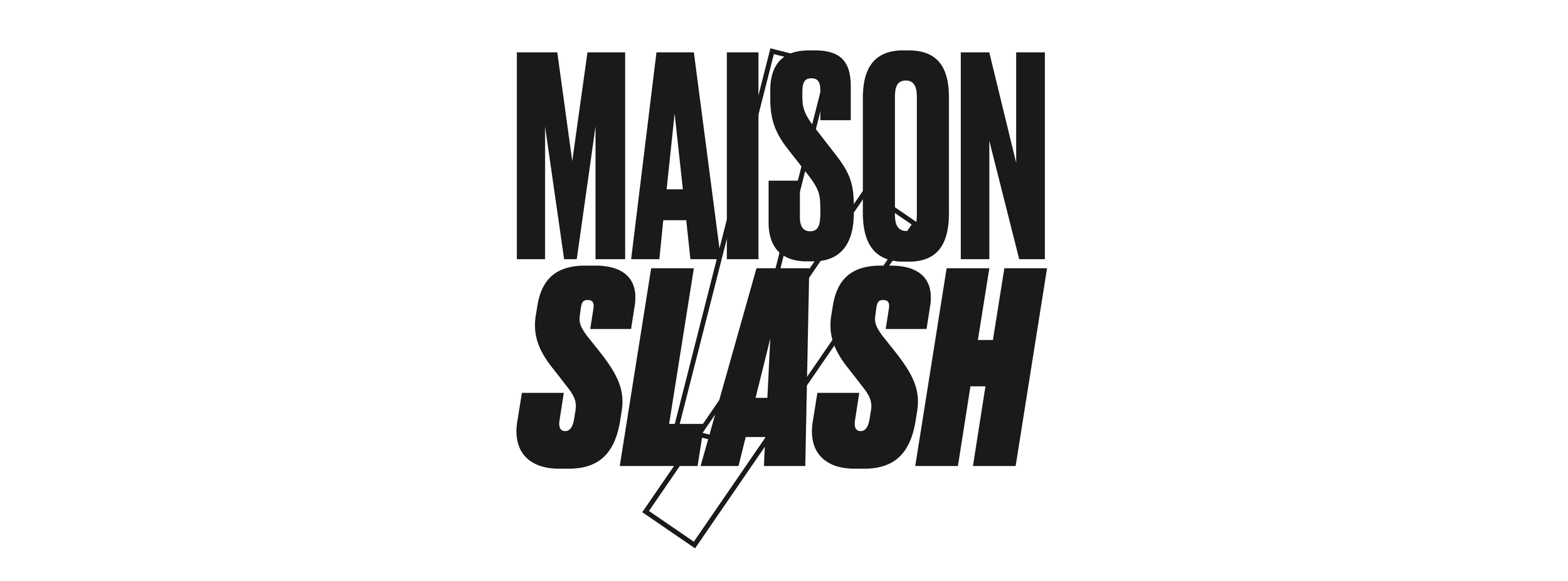
Maison Slash
Branding: Parent-friendly magazine / communication agency
Because you have children your life does not stop. Parents want something too. A pinch of rock ‘n roll, some time for yourself, maybe some inspiration, or who knows just recognition? That is what Maison Slash wants to offer. For every parent. They also have a job, hobbies, social life, etc. The little time these slashparents have, they prefer to spend it together with their children, and make full use of it. Parentfriendly, that is what Maison Slash is all about. This lifestyle e-zine is read by about 80K parents per month.

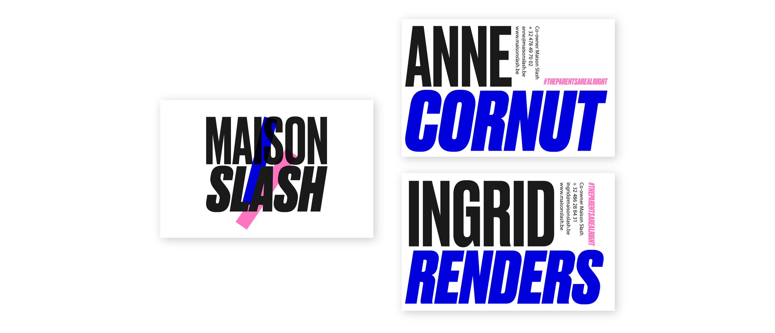
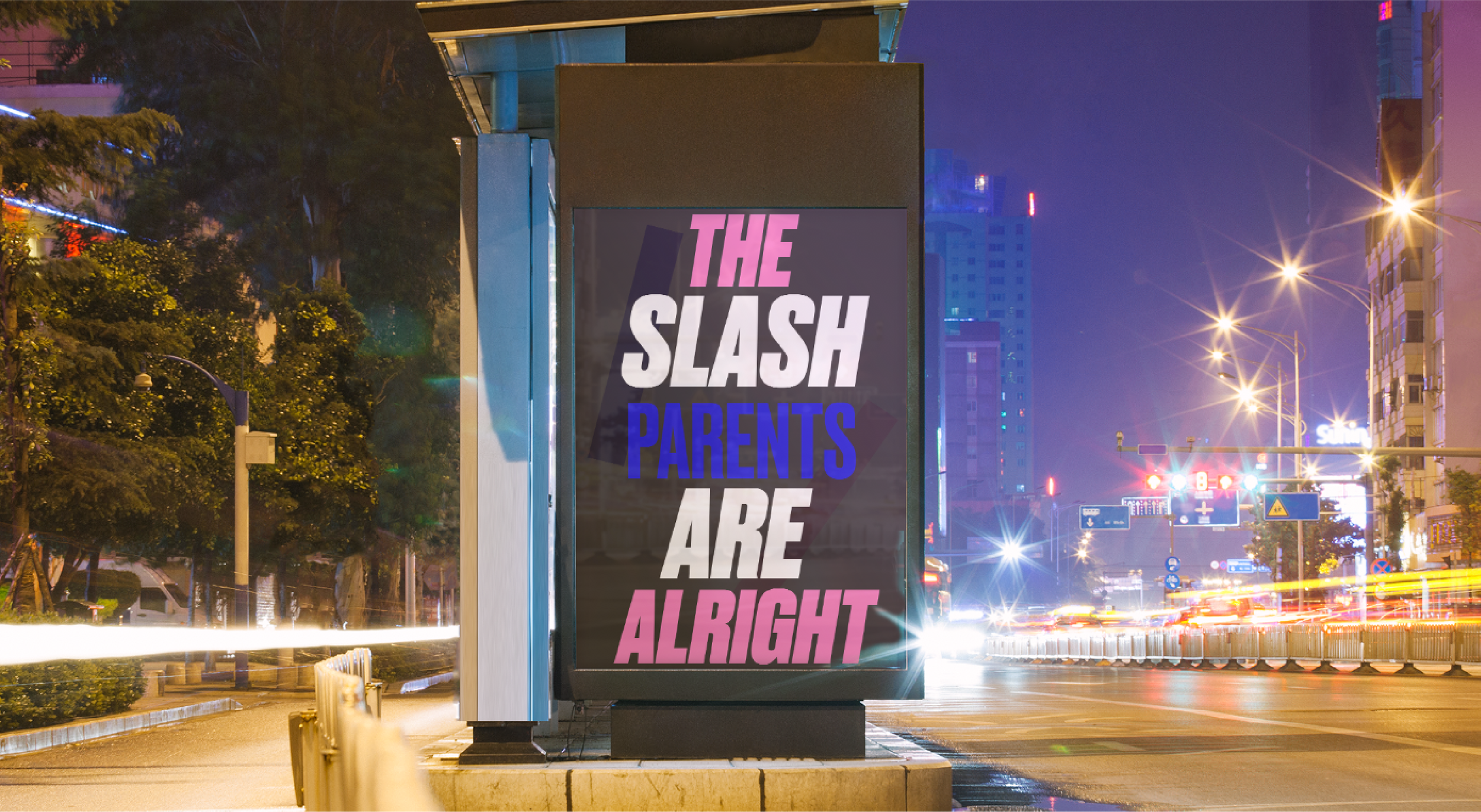
This branding suggests the 'slash' both through the cursive font for 'slash' and the multiplicity of the slash parent is highlighted by the two flashy slashes in the logo.
This style is mainly based on the idea of big & bold: all letters are large and the colours are in your face. We have chosen pink here in order not to make everything too harsh, and at the same time, blue and pink naturally remind of children.