JC De Bilding
Branding: Youth centre of the city Bilzen (Belgium)
Youth center De Bilding has been the new youth temple since April 2018. The Bilzen youth had to wait for a quarter of a century, but the wait was rewarded with a complex that has everything on the wishlist of the Bilzen youth: a large hall for performances or parties, a youth café for 18-year-olds, a rehearsal room and a flashy entrance hall. With JC De Bilding, future generations can reminisce for a long time to come.

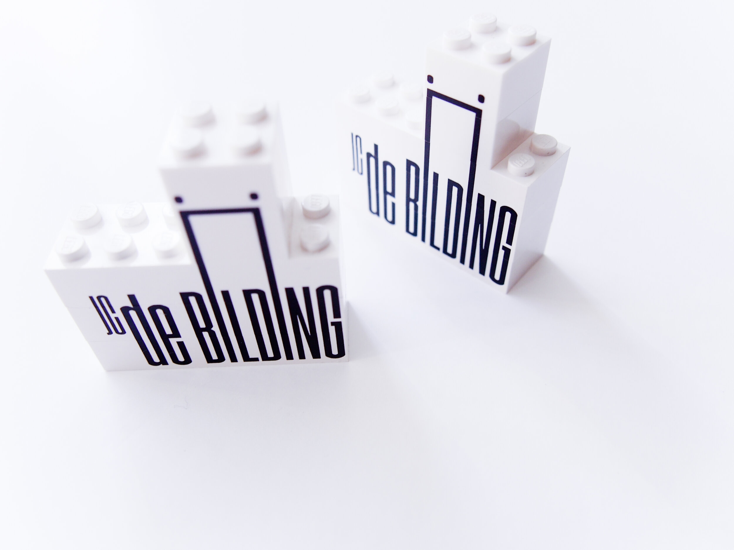
De Bilding's branding literally symbolizes the framework within which they work. Within the walls of de Bilding. The logo symbolizes these walls.
We have adopted that framework, or frame, as a fundamental corporate identity element. After all, what de Bilding does - and what de Bilding communicates about - falls within the framework. This gives everything de Bilding does and says an immediately recognizable identity.
The framework adapts to the content of the project. And thus the format with which communication takes place.


The dots on the letter 'i' are used as a style element for something that definitely characterizes the Bilding: confetti and party.