De Reensteen
Branding: Heritage magazine of the city of Tienen (Belgium)
De Reensteen is a hymn circle on the history & heritage of the city Tienen, Belgium. Their aim is preserving the history of the region. They’re ambassadors of several cultural and heritage institutions and draw attention to their collections and activities, including publications in the De Reensteen newsletter and on their website, with lectures, exhibitions & campaigns.
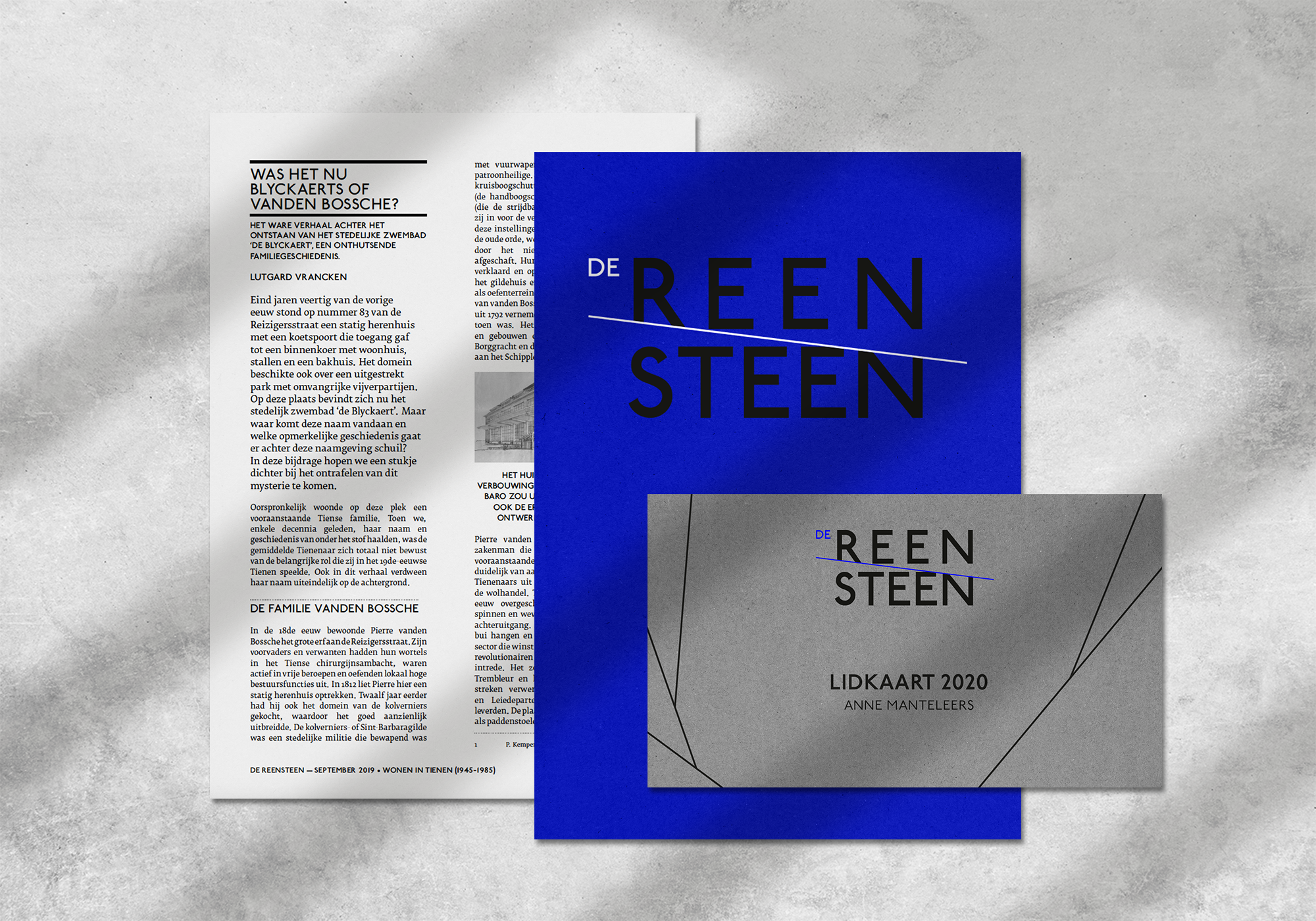
'A Reensteen' means as much as a 'boundary stone'. This branding is based on everything that is linked to such a boundary stone: borders, fertile soil, areas.
The boundaries are immediately translated into the logo by the truncation.


These truncations are continued in the titles of articles.


The idea of different types of soil was inspired by topographic maps, in which the icons were translated into decorative patterns.


